Websites
Your website looks beautiful... but does anyone actually understand what you offer?
By Stephany Riano · 25 August 2026 · 6 min read
When someone asks me to review a website, the conversation almost always begins with design. Do the colours work? Does it feel modern? Should the photograph be bigger?
Then I ask a much simpler question: What does this business actually offer? Suddenly, everything becomes quiet.
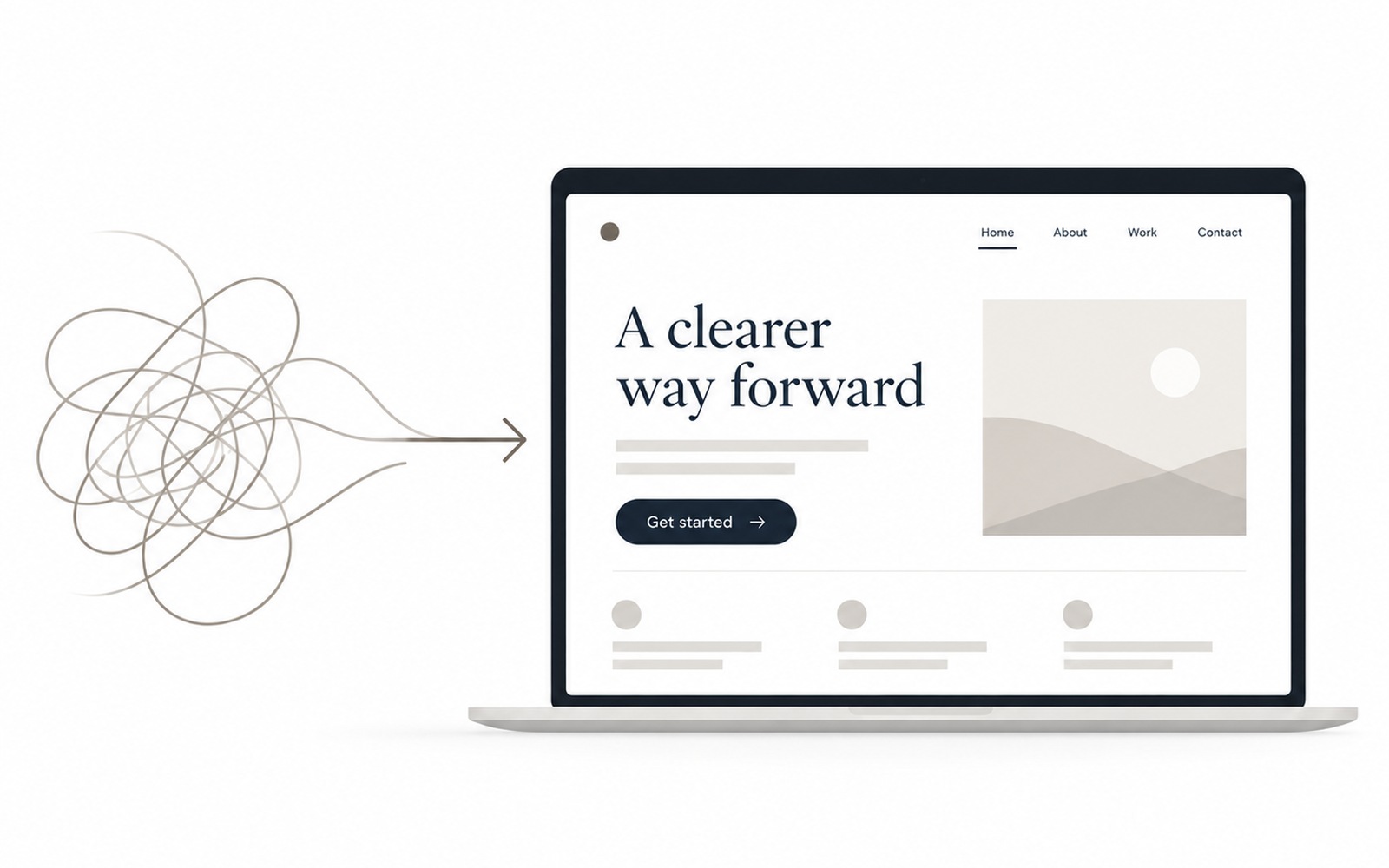
A website can look beautiful and still fail. Not because the technology is poor, but because a new visitor needs too long to understand whether they are in the right place.
The five second test is uncomfortable, but honest
Show your homepage to someone unfamiliar with the business for five seconds. Close it and ask: What is being offered? Who is it for? What should I do next?
If the answers are vague, the person is not the problem. Your website is asking them to think too hard.
People do not read your website the way you wrote it
You know every service, every sentence and every thought behind the brand. A new visitor knows none of that. They scan headings, look for familiar words and decide very quickly whether to stay.
That does not mean your website must be boring or impersonal. It can be creative, emotional and beautiful. It simply needs to be understandable first.
Where websites usually lose clarity
The headline sounds lovely but says nothing
A sentence such as We make your potential shine could describe almost anything. Add a direct statement explaining what you offer and who it is for.
The services are hidden too well
Visitors should not need to read your whole story before finding the offer. Show how you help early. Your story can build trust afterwards.
Everything appears equally important
When five buttons, three offers and two popups compete for attention, nobody knows the next step. Choose one primary action for each page.
The website only talks about the company
Experience and personality matter. But visitors first ask whether you understand their problem. Show them where they fit into your service.
My fifteen minute clarity check
- Read the first screen aloud. Can you identify the offer, audience and benefit?
- Mark every broad claim and ask whether it could describe ten other businesses
- Count all competing calls to action
- Open the page on your phone and check what appears before scrolling
- Ask someone outside the business to complete the five second test
Clarity is not only good for conversion
Google and AI systems also need to understand what your business does. Clear services, direct headings and understandable copy help them classify your website.
That is why clarity often improves several things at once: people stay longer, relevant enquiries become more likely and search systems understand the business more easily.
You do not need to show less personality
Businesses sometimes worry that clear language will make the brand ordinary. I see it differently. Clarity creates the space in which your personality can actually be understood.
First say clearly what you do. Then show how you think, why your approach is different and why someone should work with you. That is where it becomes interesting 😏
Unsure whether your website communicates clearly enough? Let us look at it together. For the next foundation, read SEO basics for small businesses.
Let’s work together
Looking for stronger SEO, a better website or support with your digital marketing? I’d be happy to talk.
Let’s work together